


My role: resourcing and managing production of sizzle reel, as well as various renders, copy, and packaging.
Burger King is on a mission to transform its business, achieving the highest standards for food quality, sustainability and restaurant experiences in the QSR industry. It was time for their visual identity to reflect the rest of their business by creating a brand world that modern consumers could feel good about.
For Burger King’s first global rebrand in more than two decades, we set out to make the brand feel less synthetic and artificial, and more real, crave-able and tasty. We were inspired by the brand’s original logo and how it has grown to have an iconic place in culture. The new logo pays homage to the brand’s heritage with a refined design that’s confident, simple and fun.
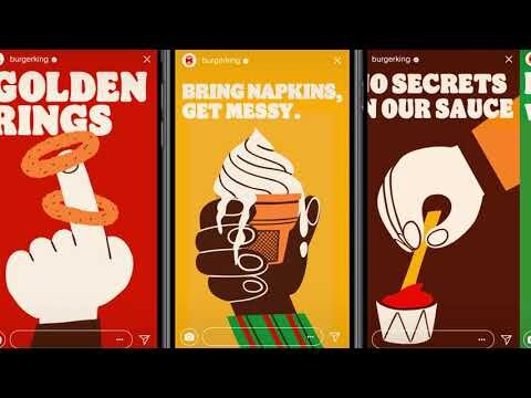
To celebrate Burger King’s big leap forward, we introduced an in-your-face photography style that uses big, dramatic close-ups to get people to crave the food and to communicate its freshness, flame-grilling perfection and above all, taste. A playful illustration style allows the brand to tell memorable stories like never before.
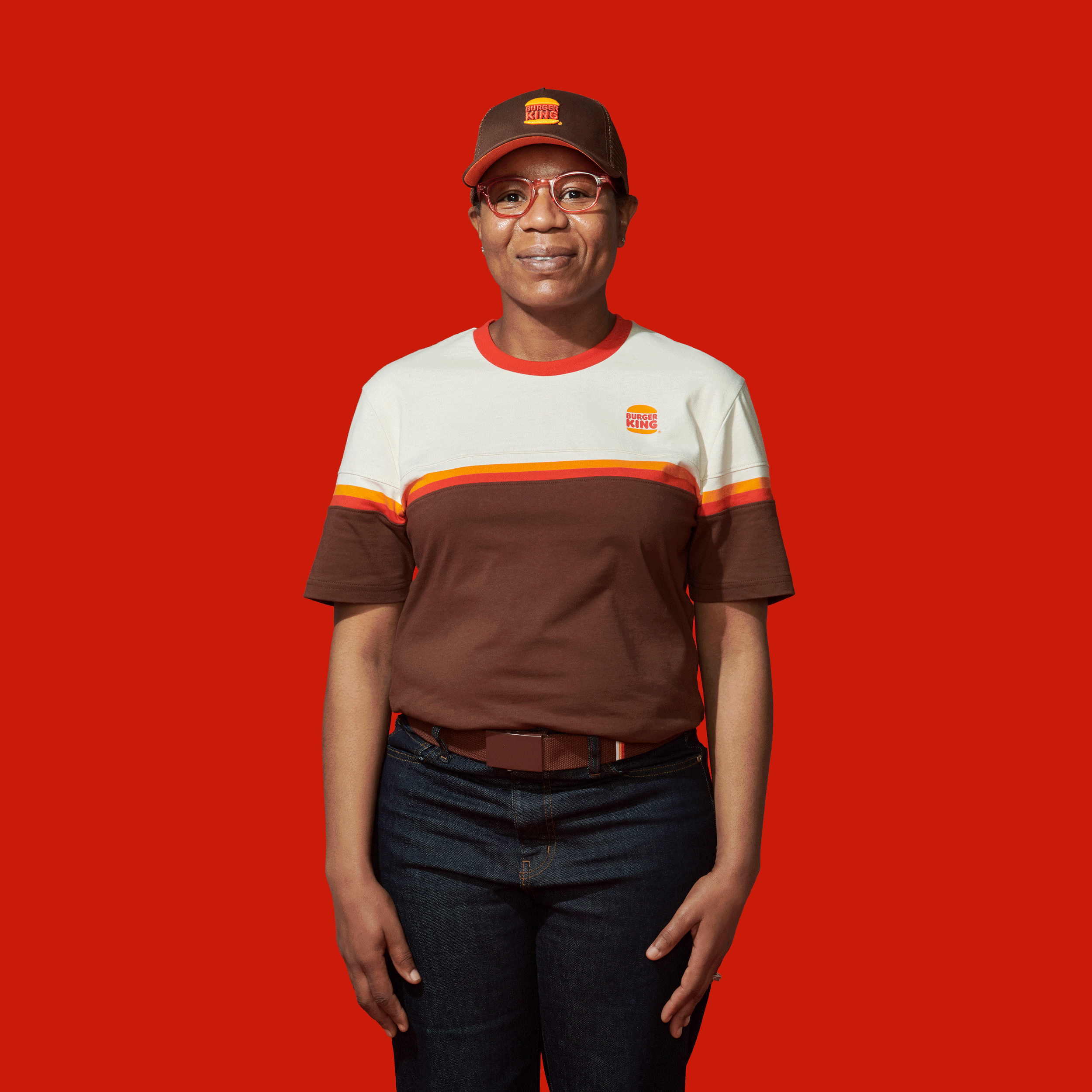
An irreverently bold typeface, Flame Sans evokes the natural, organic shapes of food. Warmer colors bring vibrant, fresh ingredients and the brand’s trademark flame-grilling method to life in packaging, crew uniforms, and digital experiences.
CAPABILITIES
Brand Strategy
Brand Identity
Naming and Writing
Packaging
Film and Motion
Brand Activation
FEATURED